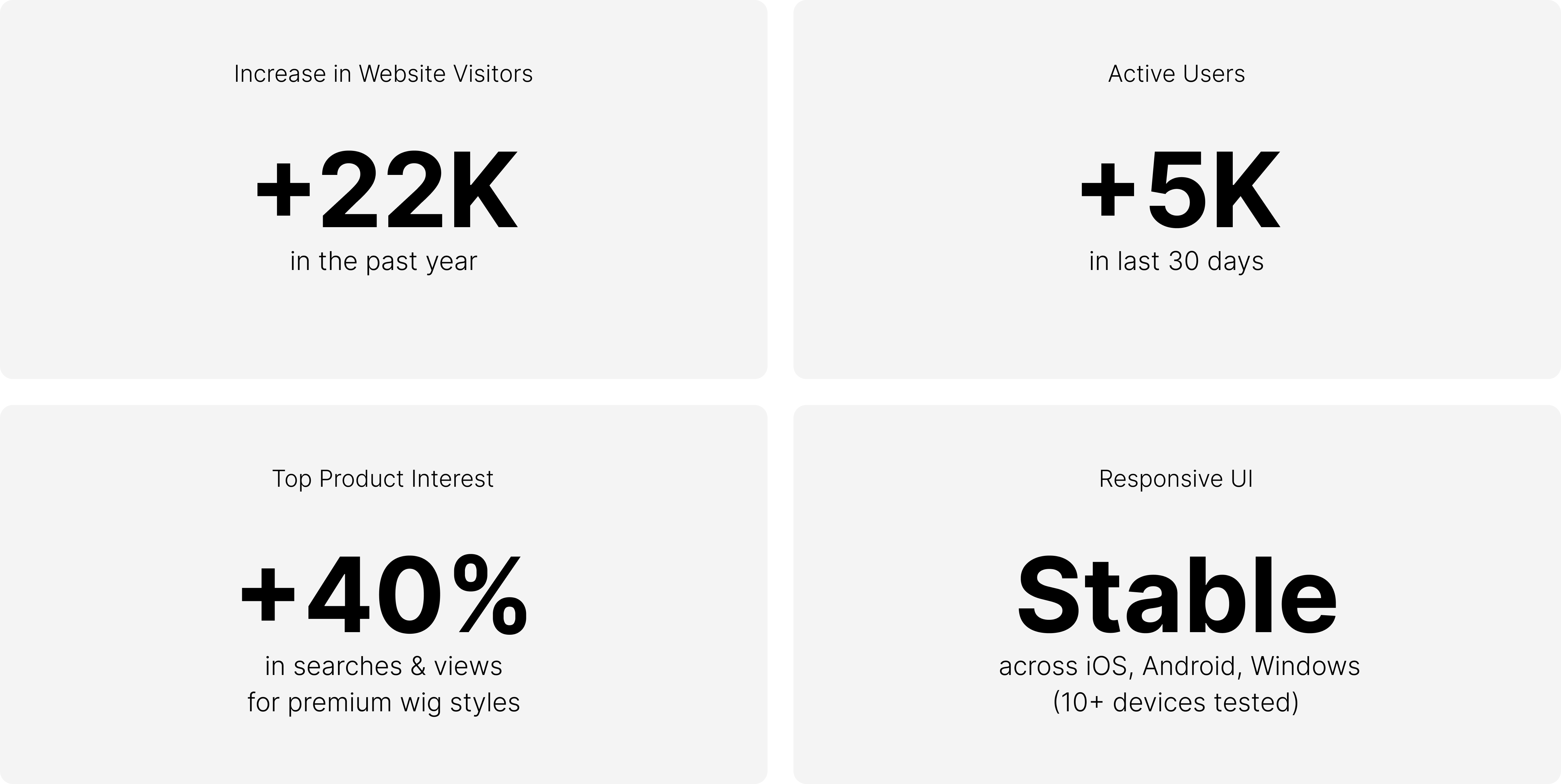
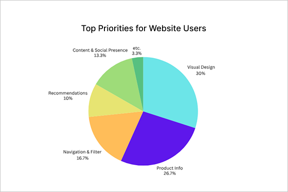
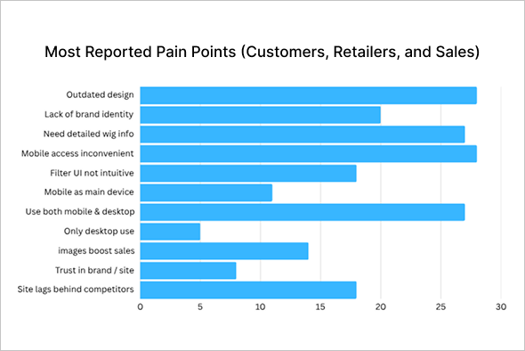
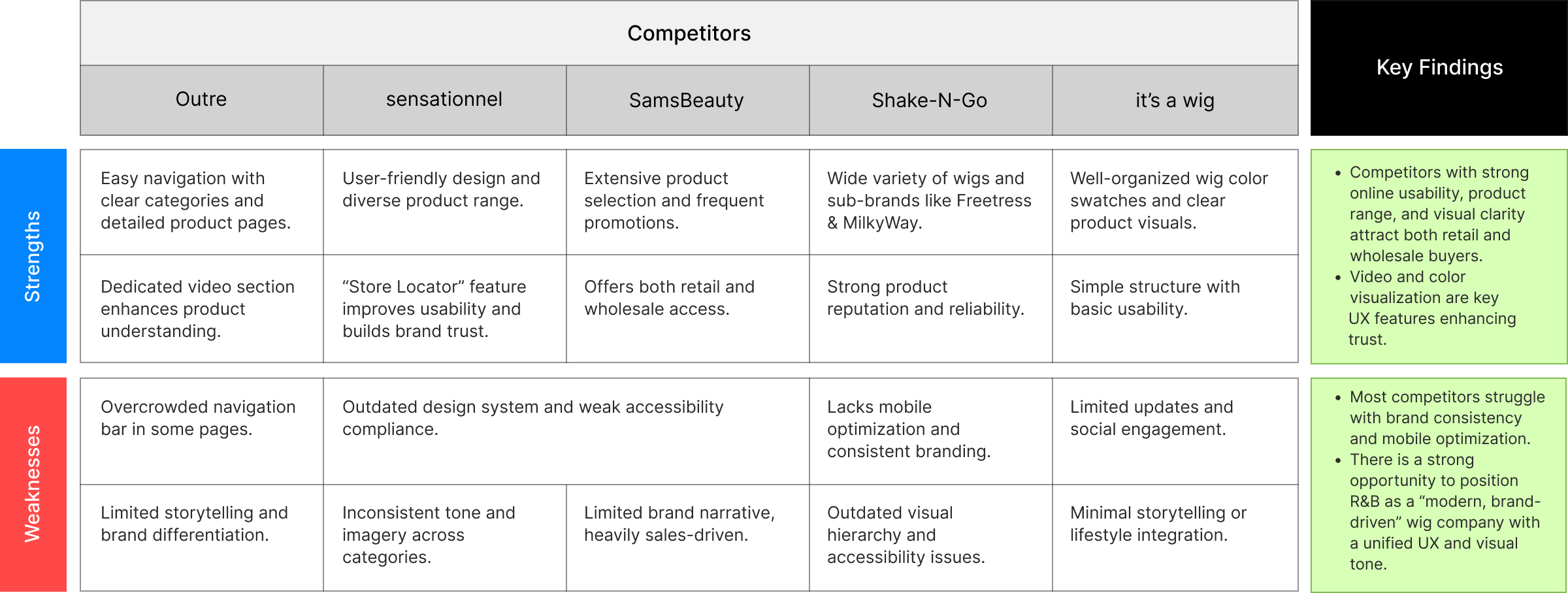
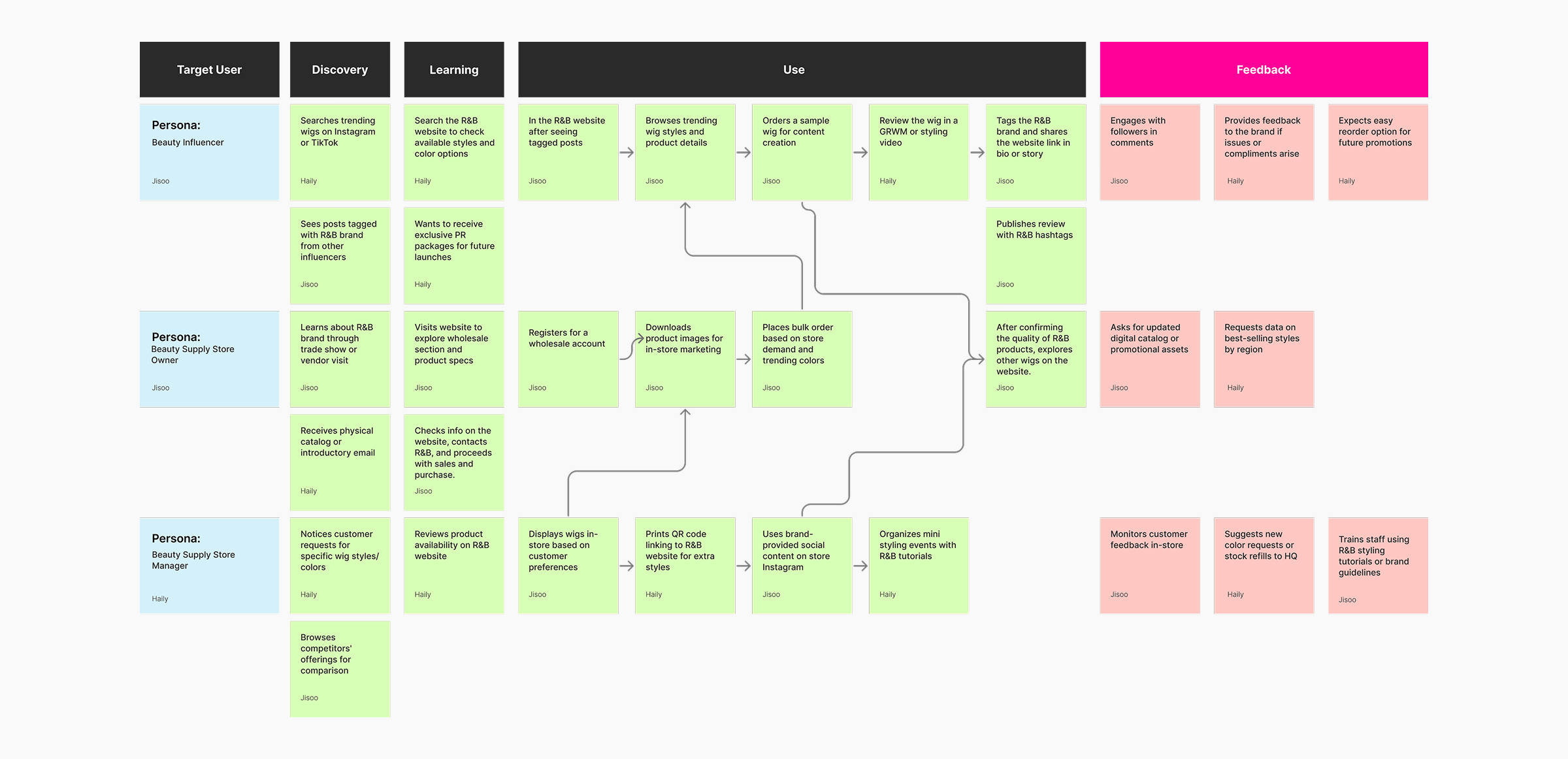
RnB Collection

Renewal · UX/UI design · Website · Research
Totally revamped the R&B website to better showcase the brand and improve the user experience, doing so with a limited budget.
# Branding
# Renewal
# Problem Solving
# Responsive website
Projects
Team Project
2 Designers
Duration
2 Months
Sector
Beauty Hair Wig, Whole Sale, Catalog, e-commerce
Tools
Figma, Photoshop,
Illustration, Miro, Wordpress
My Role
I researched the beauty wig market and analyzed the current site’s issues to plan a branding-focused redesign. While I worked on both design and planning, the final design was based on another designer’s proposal.
Project Overview
Overview
R&B Collection has been a trusted brand in the beauty wig market for 20 years. However, its existing Magento-based website suffered from low accessibility, frequent errors due to updates, and difficult maintenance, leading to increased customer dissatisfaction and a negative impact on brand image. To address these issues, we decided to revamp the website within a limited budget to enhance the customer experience.
Goal
We will conduct market research on our main customers, African-American consumers, to understand their preferred colors and brands. Additionally, we will analyze competitor websites to identify and improve any shortcomings on our own site.Our goal is to make it easier for both store customers and our sales team to access the website, obtain product information, and drive sales. By enhancing the user experience, reducing inconvenience, and lowering the site’s bounce rate, we aim to support overall sales growth.
  1. Detailed Wig Information Page: The page should allow users to easily check actual wig color chips, brand information, detailed wig textures, and cap structures.
  2. Accessible on Various Devices: The website should be optimized for seamless access on desktops, tablets, and mobiles, allowing users to use it flexibly from anywhere.
  3. Product Quantity Check via Website: Users should be able to find nearby wig stores and check the stock of their desired wig brands on the website. Additionally, the company should connect an inventory management program to the website to monitor stock efficiently, helping customers quickly and easily find the products they need.
These features allow users to conveniently use the website regardless of their device or location.
Initial Thinking
Target Users
  • Targeting African-American men and women in their 20s and 30s.
  • Beauty-conscious young African-American women.
  • women of various ages who use wigs.
  • Fashion-conscious African-American men who use durags and men's grooming products.
  • Wholesale stores that sell wigs.
Research Methods
  • Online survey (Miro)
  • 1:1 in-depth interview
  • Customer Survey via Phone
Design Process
How might we..
How might we renew the website to effectively convey the company’s wig information, enhance brand identity, and improve website accessibility?
Research
Part 01
Identifying Opportunity.
We conducted research with various customers to identify the website’s strengths, weaknesses, and areas for improvement. Based on 11 key questions, we held 5–10 minute interviews, gathered feedback at a beauty show, and conducted in-depth interviews with 3 sales team members and 5 beauty supply customers. These insights helped us develop clear strategies to improve the customer experience.
Method :  In-depth Interview, Phone interview, Market research and Reviews
Q&A Interview
In-depth Interview (Georgia Beauty Show)
Q1. What do you like most about the current R&B website?
Q2. Have you ever experienced any difficulties or inconveniences while using the R&B website?
Q3. How easy is it to find the wig styles or products you are looking for?
Q4. Are there any features you would like to see added or improved on the website?
Q5. How would you rate the overall design and appearance of the website?
Q6. Do you prefer shopping on a desktop, mobile device, or both?
Q7.  How likely are you to recommend the website to others? Why or why not?
Q8. Did you find the information you needed to make a purchase decision?
Q9. What could we do to make your shopping experience more enjoyable?
Q10. What changes or features do you think are absolutely necessary to improve your shopping experienceon the current R&B website?
Q11. How do you usually discover new wig products or trends online?
Interview Hight-lights
01
It would be great if the website was easier to access on mobile and iPad.
02
I would like to be able to check wig availability on the website and easily find information about nearby stores and their stock.
03
It would be great if social communication, like on Instagram, was more active, and if the website had a younger, trendier vibe
*Certainly, there's room to refine my research approach here! I explore this further in my conclusion...
Customers want a more trendy website design that allows them to check product details and inventory across various devices. Enhancing the site’s accessibility and modernizing its design is essential to improving customer experience and driving sales.
Survey results show that Customers mostly visit our website using mobile devices and want features that let them check inventory, find nearby stores, and see available quantities when buying wigs. They also gave feedback that they’d like the site to have a more trendy look.
Wig retailers also use the website to check wig details before purchasing and then sell these to their customers. They mentioned that the more detailed the wig information on the site, the easier it is for them to sell to customers.
The R&B sales team reported that retailers are actively buying wigs through the website, and they noted that the wig images and information provided on the site help boost our sales.
Based on these findings, renewing the website is an important opportunity to make shopping easier for customers across different devices and to strengthen our brand identity. Providing useful information on the site is also expected to increase sales. Therefore, a website renewal is essential to improving customer satisfaction and enhancing our brand value.
Part 02
Researching E-commerce solutions
After comparing three different e-commerce solutions, we decided to choose a company that fits our budget, site maintenance needs, and design specifications to renew our website.
Conclusion: We chose WordPress as the platform to build our website within our limited budget, with a total cost of $2,300. Due to budget constraints, we were unable to implement inventory tracking or a shopping feature. Instead, we focused on providing customers with detailed information about our wig products through a catalog-style format.
Part 02
Understanding the problem.
R&B is a beauty fashion wig site that helps users easily find various information about wigs and discover styles that suit them. Through the website, users can set and achieve the following goals:
1. Exploring the Latest Wig Trends:
  • Enhancing the website to allow customers to easily explore the latest wig trends can strengthen the brand's modern image and attract more customers.
2. Checking Nearby Store and Inventory Information:
  • Providing a feature that allows customers to easily check the location and inventory of nearby stores can support faster purchase decisions.
3. Website Renewal:
  • By renewing the website, we can effectively convey the brand identity to customers and increase the value of R&B products. Additionally, the goal is to lower the perceived age of the site by targeting a younger audience through design improvements.
4. Accessibility Across Devices:
  • Ensuring seamless accessibility across all devices can improve user experience and reduce customer drop-off rates.
Method :  Competitive Analysis, Pain Points
Competitive Analysis
We should focus on branding and increase site usage across various devices.
Many wig companies focus on branding and making it easy for customers to find wigs and information across devices. We should also identify customer needs and find ways to highlight our brand.
Pain Points
Analysis showed that poor website accessibility led to a high bounce rate, making it harder for users to engage and navigate the site effectively.
Customers leave the site due to difficulty finding information, and the sales team avoids using it as a resource. Improving accessibility and optimizing the information structure will enhance usability for both, ultimately strengthening brand trust.
Current Website Analysis
Design
Information Architecture
We structured the menu for the redesigned website and analyzed which information customers should see first to enhance accessibility. Using these insights, we brainstormed key features, rapidly sketched ideas with the Crazy 8 method, and refined them into detailed Wireframing.
Crazy 8's
Grid System
The web was redesigned using the grid system. I worked on three devices: web, tablet, and mobile.
Desktop - 1920px / 12 Columns
Tablet - 834px / 6 Columns
Mobile - 390px / 4 Columns
Style Guide
Muhtar Kent, former CEO of The Coca-Cola Company.
“A brand is a promise.
A good brand is a promise kept.”
What’s new?
We improved the visual appeal and clarity of wig product information using trendy media and simplified layouts. Enhanced navigation, search, and downloadable resources created a more intuitive and user-friendly experience across all devices.
Final Screen
Final Design for Website
Steve Jobs
“Design is not just what it looks like and feels like.
Design is how it works.”
Usability Test
We primarily tested with young African-American consumers who are highly attuned to fashion and trends. Additionally, beauty store owners, managers, and the sales team took part in the testing. Afterward, they shared feedback on areas for improvement.
Female 23, Hair Model
Female 32, Manager of Store
Male 58, Beauty Supply
Conclusion
Moving Forward
  • To increase user engagement, the website must be designed for an intuitive and seamless experience.
  • Provide valuable content to enhance customer loyalty and continuously improve the website through regular customer interviews.
  • Continuous research is essential to explore effective strategies for strengthening the company’s brand identity.
What I  learned
  • I gained research experience by conducting extensive analysis to optimize the website within a limited budget.
  • I learned to balance perspectives and ensure usability through problem analysis and stakeholder engagement in website renewal.
  • Although my design proposal was not selected, I played a key role in user research and design direction, reinforcing the value of adaptability and collaboration.
  • Communicating with executives and persuading resistance to change was challenging but rewarding, strengthening my skills in logical arguments and data-driven decisions.
© 2025 Designed by Jisoo Kim